
Show or Hide a Section for Specific Screen Sizes (v2 Editor)
You can control which sections appear on desktop, tablet, and mobile devices. This lets you optimize your layout for different screen sizes.
This feature does not work for the header and footer sections. Headers and footers are always visible on all screen sizes.
Show or hide a section for specific screen sizes
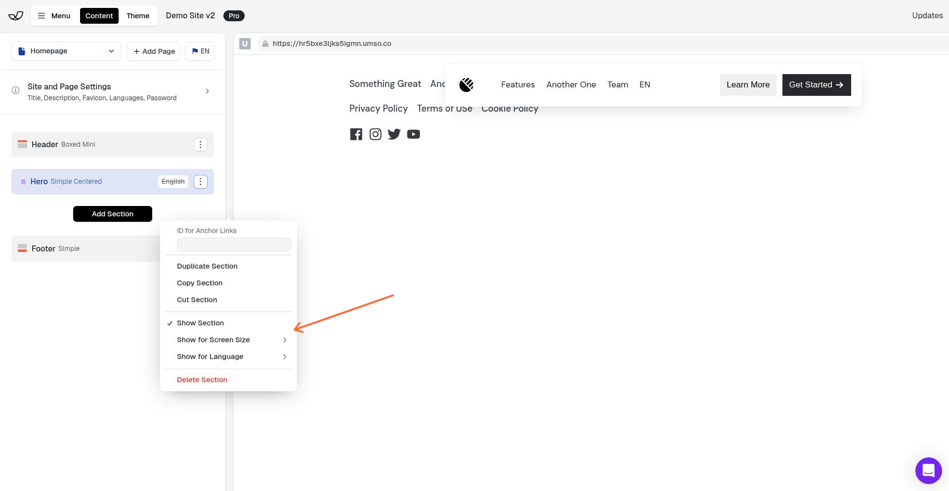
In the left sidebar, click the section you want to configure.
In the right panel, click the 3-dot menu icon and select Show for Screen Size.
Toggle the screen sizes where you want the section to appear:
Desktop — screens wider than 770px
Tablet — screens between 500px and 770px
Phone — screens narrower than 500px
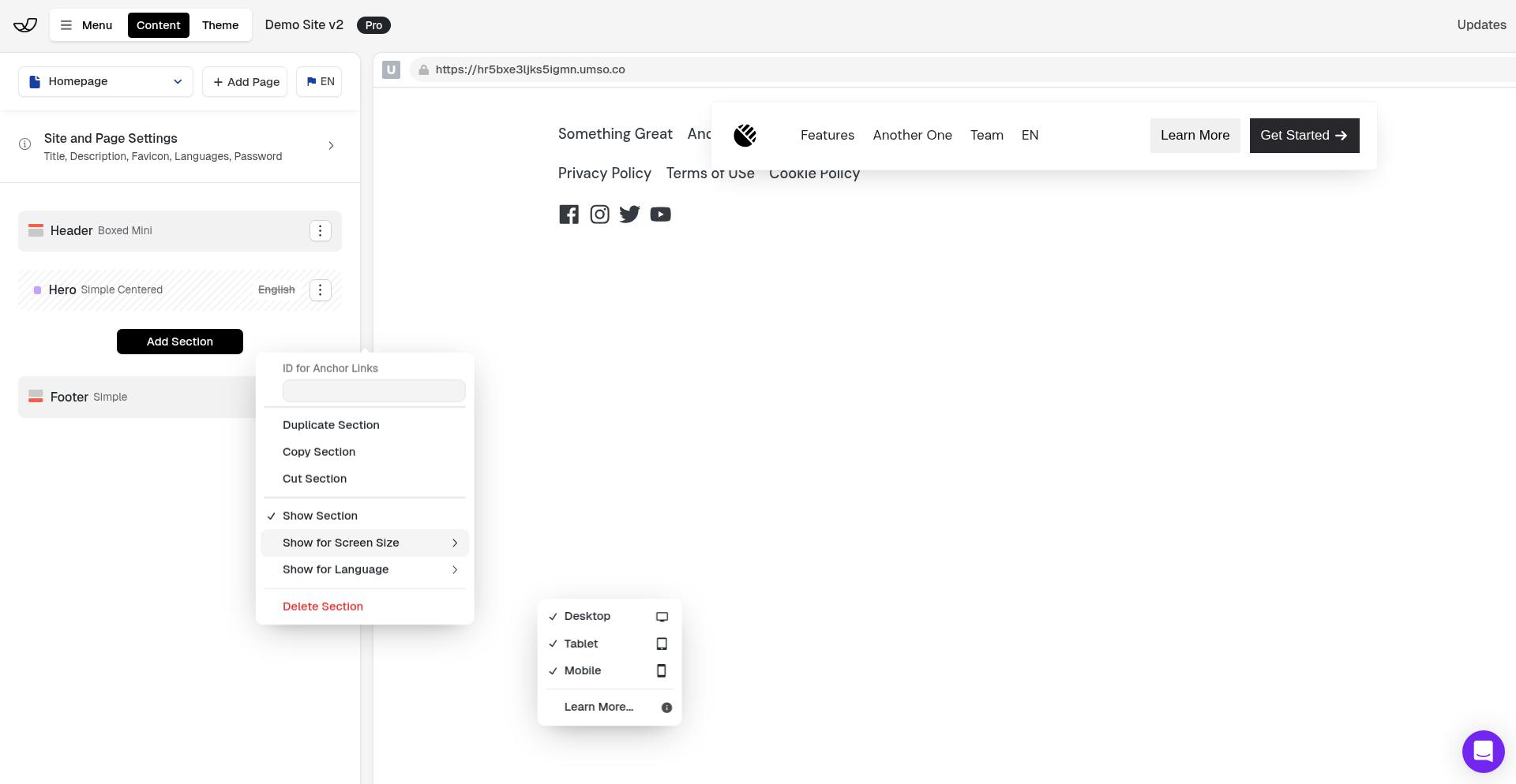
The section will only appear on the screen sizes you select. Deselected screen sizes will hide the section completely from those devices.
Use cases
Hide complex sections on mobile — Remove data-heavy tables or multi-column layouts that don't work well on small screens
Create mobile alternatives — Build a simplified mobile version of a section and hide the desktop version on phones
Different layouts per device — Show different hero sections, CTAs, or content blocks optimized for each screen size
Remove decorative elements — Hide spacers, large images, or visual flourishes on mobile to improve load times
Sections are visible on all screen sizes by default. You only need to adjust these settings if you want to hide a section from specific devices.