
Hide a Section for Specific Screen Sizes (v1 Editor)
You can control which sections appear on desktop, tablet, and mobile devices. This lets you optimize your layout for different screen sizes.
Show or hide a section for specific screen sizes
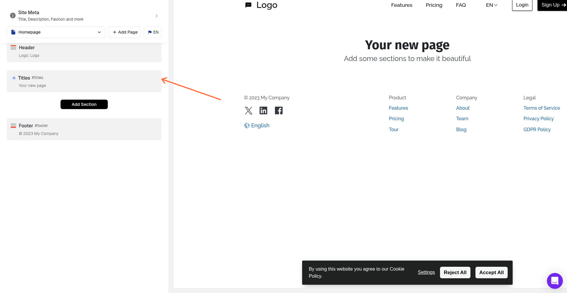
In the left sidebar, click the section you want to configure.
In the right panel, find Show Section for these Display sizes.
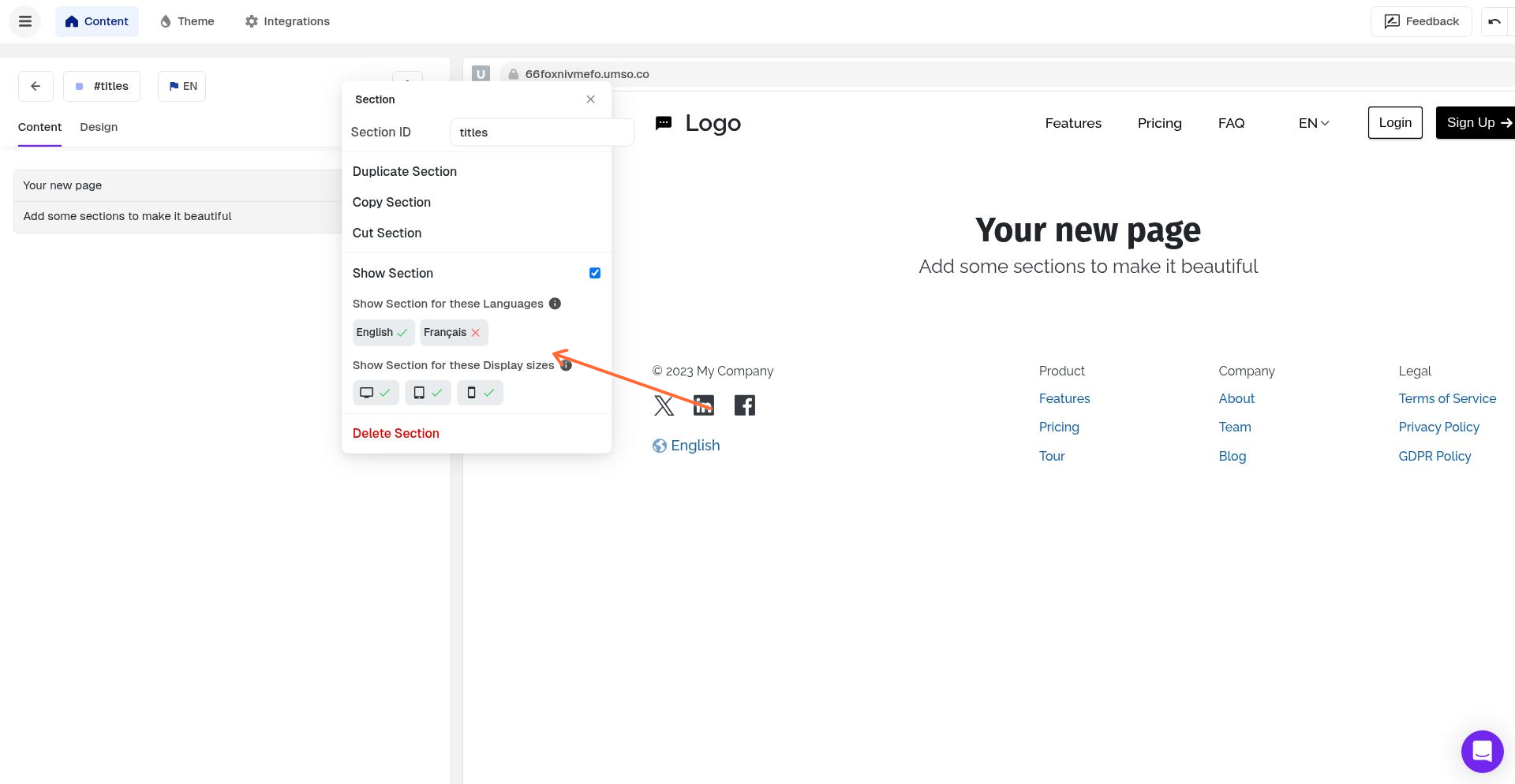
Toggle the screen sizes where you want the section to appear:
Desktop – Large screens
Tablet – Medium screens
Mobile – Small screens
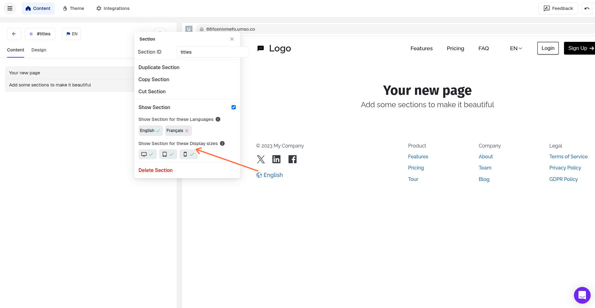
The section will only appear on the screen sizes you select. Deselected sizes will hide the section on those devices.
Use-cases:
This feature is useful when you want to:
Hide complex sections on mobile to simplify the experience
Show mobile-optimized alternatives to desktop sections
Display different layouts or content based on device type
Remove decorative elements on smaller screens
Sections are visible on all screen sizes by default. You only need to configure this if you want to hide a section from specific devices.
For more details about responsive behavior and best practices, see Responsive Hiding for Sections. While that article covers the v3 editor, the feature works the same way in v1.