
Responsive Hiding for Sections
Hide single sections depending on the screen size of your visitors. To do so you can hide each section individually for different screen sizes in your Section's settings shown here:
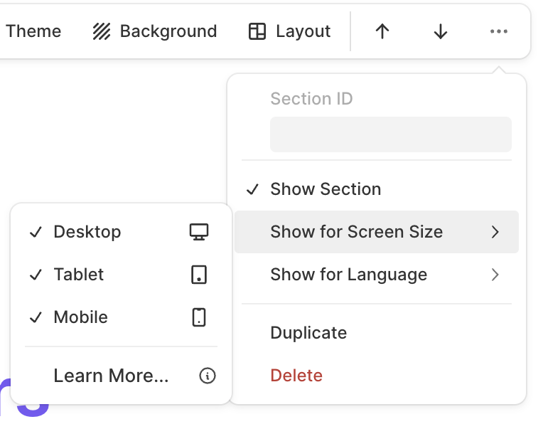
The different screen sizes are Desktop with more than 770 pixels, Tablet 500 - 770 pixels and Phone under 500 pixels.
This new feature provides more flexibility in terms of responsiveness for smaller screens and allows you to manage your website's design perfectly for all screen sizes.
Was this helpful?